The appearance and user experience of your website are equally important to your audience as its loading speed. Combining excellent web design with efficient performance guarantees that every site you create is visually appealing and user-friendly.
Think With Google reports that when page load time increases from one to three seconds, the bounce rate of your website can rise by 32%. This highlights the significance of usability for the success of your website. Without high-quality visuals and fast loading times, visitors will simply lack the opportunity or patience to engage with your design.
While visual elements like product photos, artwork, or event videos play a significant role in conveying the story of your web design to visitors, they can potentially slow down your site if not optimized correctly. By following these best practices for media optimization, you can ensure that your site not only looks impressive but also performs exceptionally well.
Optimize the image sizes for upload It is important to always upload the highest quality image available. This entails selecting visuals and media that not only look impressive but also upload quickly. To ensure efficient loading, it is generally recommended to keep your file size under 25MB (or 15MB for GIFs). Additionally, starting with an uncompressed or RAW file is advisable to maintain the quality of your visuals. An uncompressed or RAW file contains all the original data of the image without any reduction in byte size.
- Prefer JPG over PNG in most cases JPG images, being the most commonly used format, are generally much smaller compared to equivalent PNG images, sometimes up to 10 times smaller. Due to their smaller size, it is usually preferable to choose JPG (Joint Photographic Experts Group) over PNG (Portable Network Graphic). When making a decision between JPG and PNG for your website, it’s important to note that these formats are resized differently. JPG uses algorithms to reconstruct an approximate version of the original data when resized and delivered over the web. This is known as lossy compression, where some of the original data is permanently removed or “lost.” On the other hand, when PNGs are resized, the format employs a compression algorithm that allows the original data to be perfectly reconstructed, known as lossless compression. Essentially, if you want to preserve the quality of your images, you might opt for a PNG. However, this trade-off involves working with larger files that could potentially affect your site’s performance.
📌 PRO TIP: There are specific cases where choosing a PNG over a JPG is recommended:
- When you require transparency in the image, such as wanting the subject or foreground to appear as if it has been cut out.
- When extreme high quality and sharpness are necessary, such as in images with small text (e.g., a screenshot) or rich colors (e.g., gradients).
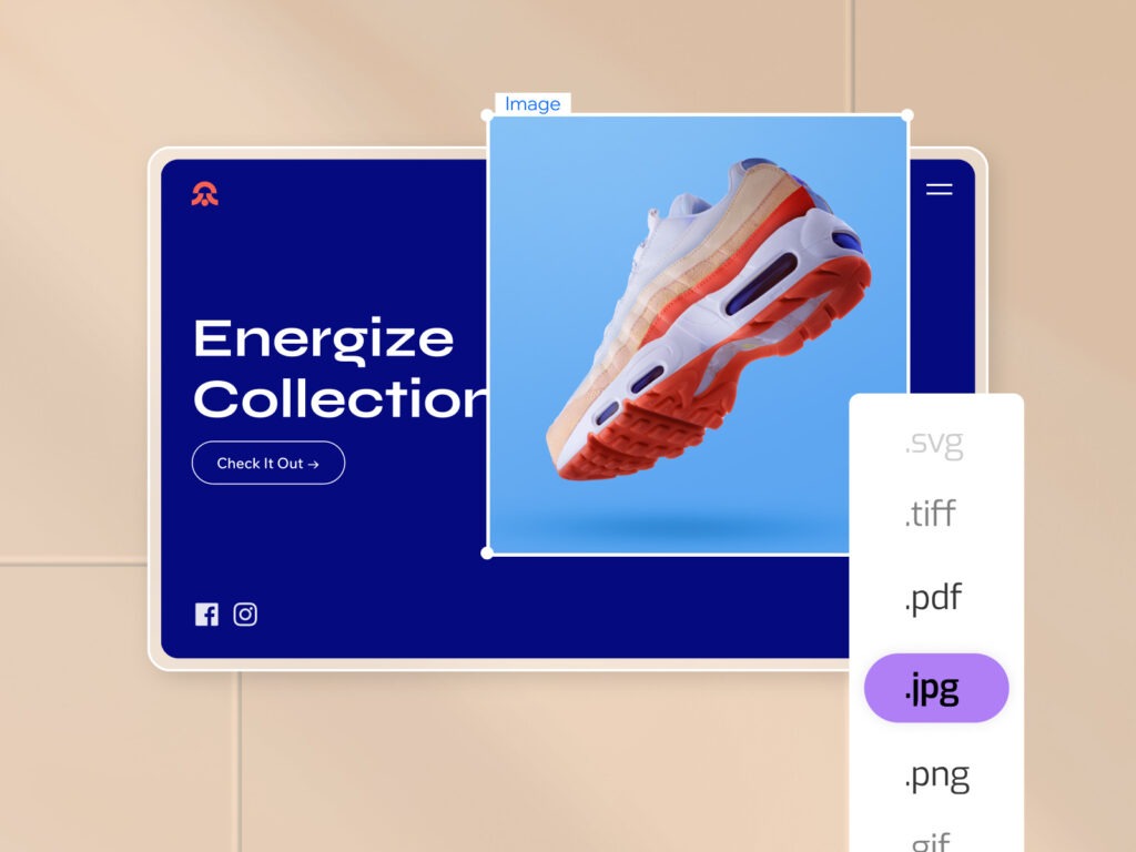
- Customize image compression settings for improved sharpness When incorporating images into your web design, you may discover that the platform you’re using has its own default compression settings for images. For instance, after uploading a JPEG or PNG file to the Wix Editor, it automatically reduces the compression to a default of 90% quality. However, you have the option to adjust this default setting to ensure your images maintain sharpness while still loading quickly.
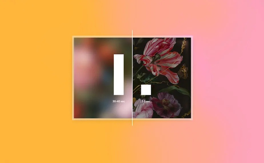
- Embrace the benefits of lazy loading While navigating through your website, you might observe that images initially appear blurry for a brief moment before fully loading. Don’t worry, this phenomenon is called lazy loading, and it serves as a placeholder for the optimized version of the image. Lazy loading is employed to accelerate loading time and display something to visitors as soon as they land on your site. Essentially, the browser initially presents a small, blurred version of the image, allowing it to “lazy-load” and optimize the high-resolution images according to the display’s dimensions. As images come into view during scrolling, the high-resolution versions download and replace the Low-Quality Image Placeholder (LQIP) that is currently displayed. Aside from enhancing the user experience, LQIP also benefits your website’s search engine optimization (SEO) since it provides indexed images to search engines instead of blank or broken image icons.
- Differentiate between SVG and PNG usage Scalable Vector Graphics (SVGs) are delivered in an XML-based format and employ mathematical formulas to create high-quality images. SVGs consist of vector-based contents that instruct the browser on what to display using a complex network of lines, dots, shapes, and algorithms. This makes SVGs more flexible compared to PNGs, as their size depends on the number of elements and “nodes” they contain. On the other hand, PNGs are raster-based formats, composed of a fixed number of pixel grids that offer high quality but are difficult to resize. SVGs retain their sharpness regardless of resolution and size, even when the dimensions of the viewport change. When considering the impact on performance due to the image’s size, it is advisable to use SVG instead of raster formats like PNG, unless the SVG itself is very complex (e.g., depicting the coastline of Norway) and the element’s actual dimensions are relatively small compared to the image.
📌 PRO TIP: To optimize the use of SVGs on your website, upload SVG files with weights of up to 250KB.
Furthermore, it is important to avoid content that may pose security issues or cause browser crashes. For instance, SMIL animations contain insecure elements and negatively impact runtime performance, which is why modern browsers do not support them.
- Select appropriate video formats Videos offer a seamless way for website visitors to engage with more content, featuring wider angles, longer messages, entertaining animations, and more. To ensure your videos appear in the highest quality without compromising page load speed, adhere to these fundamental guidelines. As a general rule, videos uploaded to your website should have a maximum size of 1GB. Before uploading your video, verify which video formats are compatible with your website platform. Some popular formats include AVI, MPEG, MPG, MPE, MP4, MKV, WebM, MOV, OGV, VOB, M4V, 3GP, DivX, XVID, MXF, WMV, M1V, FLV, and M2TS.
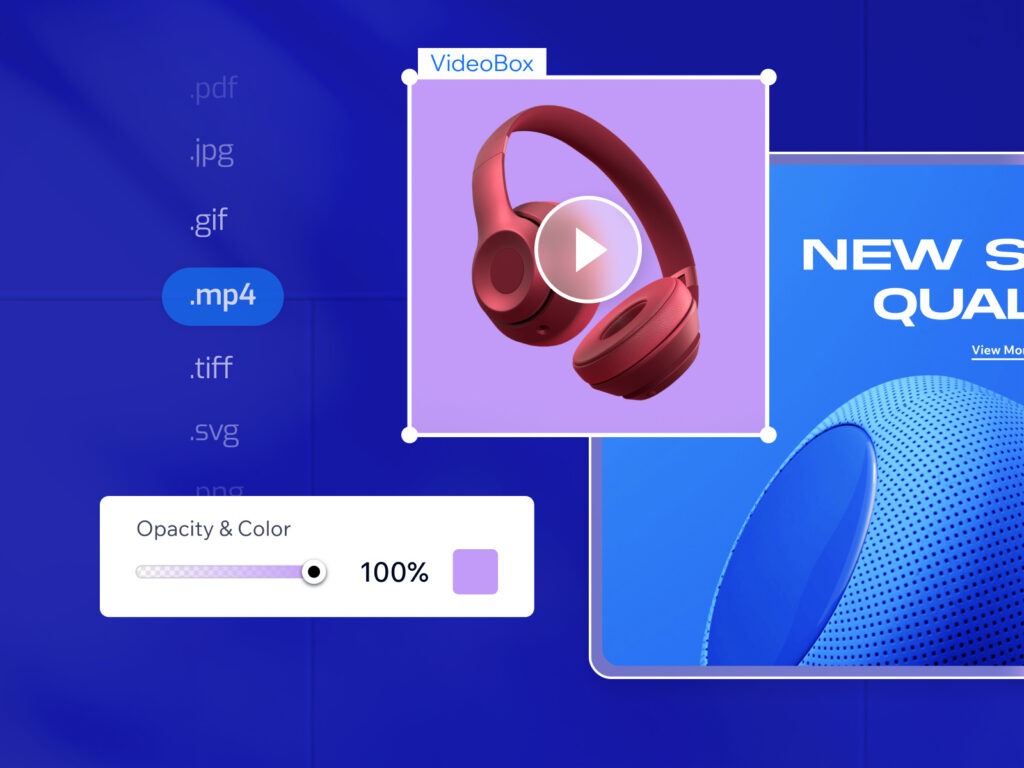
- Choose an appropriate color for your video background When incorporating a video into your website, it’s important to consider that certain parts of the video may be cropped or hidden for some visitors based on their device or browser. However, the video content itself will still occupy the entire dimensions of the video component. In such cases, you may want to add a color backdrop to compensate for the remaining background area and provide visitors with the best aesthetic experience. It’s worth noting that different browsers utilize different color spaces. Consequently, if you select a color for the video background that matches the color of the page background, these colors may appear different across various browsers. One potential solution to address this color variation is to specify a transparent background for the video, eliminating any potential discrepancies.
- Prioritize videos over GIFs (in most cases) The simple animation of a GIF can capture visitors’ attention and enhance your web design. However, GIFs have certain drawbacks that can negatively impact performance, accessibility, and overall user experience. For instance, you have limited control over the playback of GIFs on your site. Additionally, GIFs only start playing when all frames of the animation are available. Since GIFs cannot be optimized for web streaming, they can significantly slow down the loading speed of a page. When faced with the choice between a GIF and a video, it is generally recommended to opt for the latter. Videos offer support for nearly unlimited color palettes, allow controlled playback, and can be optimized for web streaming. Moreover, videos start playing on the web as soon as the first frame becomes available.
However, there are specific cases where using GIFs on your website is appropriate:
- If your content animation consists of a few frames and has a small dimension size (e.g., 100×100), a GIF is suitable.
- When you have text content in your animation and you want to ensure readability, a GIF can be used.
By considering these factors, you can make an informed decision between using videos or GIFs for your website.
In conclusion, optimizing media elements such as images and videos is crucial for creating a visually appealing and high-performing website. By following best practices for media optimization, you can strike the right balance between quality visuals and efficient loading times, ensuring an outstanding user experience.
When working with images, it’s important to upload the appropriate sizes, keeping file sizes under control to promote swift loading. Choosing the right image format, such as JPG or PNG, depends on factors like file size and the need for transparency or high quality. Adjusting default compression settings and leveraging lazy loading techniques further enhance image performance and user engagement.
For vector-based graphics, SVGs offer flexibility and sharpness across different resolutions, making them a preferred choice over raster formats like PNG in most cases. However, considering the complexity of the SVG and its impact on performance is essential.
Videos, when used appropriately, can enrich the user experience. Selecting compatible formats, keeping file sizes in check, and controlling playback contribute to optimal video performance without compromising page load speed. Additionally, considering the use of color backgrounds for videos and the potential discrepancies across different browsers helps maintain a consistent aesthetic experience.
While GIFs have their merits in catching attention and conveying concise animations, they come with limitations in terms of control, performance, and loading speed. It is generally advisable to prioritize videos over GIFs, except in specific scenarios where GIFs are better suited, such as animations with a small number of frames or when maintaining text readability is crucial.
By implementing these media optimization practices, you can create a website that seamlessly combines captivating visuals with fast-loading content, enhancing both the aesthetic appeal and user satisfaction.
