Many times, people, while having discussions with colleagues, clients, designers, developers or users, mention words such as ‘Mobile-First’ or ‘Responsive Design.’ Still, not many of us understand the core meaning of these words. Do you feel confused and lost when you hear such words? Want to be ahead of the trend? Then, you are in the apt place. Let us go step-by-step and first understand the meaning of these buzzing words to get crystal clear. It will help you get a more compact idea of the strategy of mobile-first and know if it is right for the brand or not.
Today, the entire platform and the outlook of the web has entirely changed. Here are some of the recent and exciting web facts you must know:
• Today, around 68 million Google searches take place every hour globally via mobile devices.
• 69% of the total travellers search on their mobile devices.
• In the travel industry today, bookings through mobile have increased, where approximately 70% of the traffic on the website comes from mobile devices.
Mobile users today are the target audience, and now marketers need to come up with strategies to ensure a long-term relationship with these individuals to sustain in the business.
What is Responsive Design?
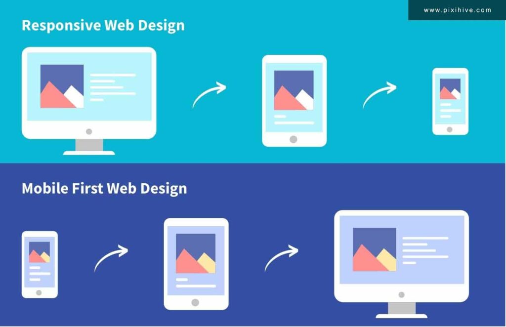
It was in 2010 when Ethan Marcotte coined the term Responsive Web Design. It is the technique in which the design of the website gets adjusted automatically based on the screen size used by the users. It is because of the responsive design that users can now browse through a website regardless of the device they use. The content and the layout of the website automatically change depending on the browser’s width of the device.
The user can also determine whether a website is manually responsive by just zooming out and in of the browsing window.
The content, design, and website’s interface get adapted itself so that the visitors can access the website through any device and from any browser. With responsive designs, there is no need to create the two versions of the same website for the mobile and the desktop.
Why do you need responsive web design in web page development?
In short, responsive design allows the website’s content to move unhindered across all screen resolutions and sizes. It also renders it to look clean and smooth across all devices. Therefore, it eliminates the need to create and maintain several website versions, thereby saving you time and effort.
What is Adaptive Design?
When a website gets equipped with responsive design features, it automatically means that it will very quickly adapt to the screen width of the user’s device, which allows the maximum amount of versatility. If the website has the feature of adaptiveness, it will then adapt to the width of the device’s screen of tablets, desktops, and smartphones. All the tools have a set width of the browser that one should know in advance, and it enables all the developers to develop the websites which adhere to the given specifications.
However, the creation of a responsive website does take a considerable amount of time and effort. It is because the website needs to adapt to each browser’s width appropriately. People generally get confused with the two terms ‘Responsive’ and ‘Adaptive’ and interchange the meaning of both these terms. But developers in today’s time need to create websites that are both adaptive and responsive. These websites are a blend of both techniques.
What is adaptive design in machine design?
Adaptive design is a type of machine design in which the existing technology is modified to create a better design. It reworks the basic features for optimization and better results.
What is the difference between adaptive web design and responsive web design?
Find the key differences between responsive vs adaptive here:
| Adaptive web design | Responsive web design |
| Uses individual layouts for different screen sizes | Uses a single layout for multiple devices and different screen sizes |
| The website automatically selects the most appropriate size | The design rearranges itself based on the device and screen size |
| Templates are optimized for each device | One template for all devices |
| Only pre-selected and device-specific information is displayed | All content or information is downloadable |
| Fast loading time | Relatively slower loading time |
What is the difference between mobile responsive and mobile-friendly?
With a mobile-responsive design, one can “experience” the same information when transitioning from a desktop to a mobile device. Mobile responsive designs are not developed separately. Instead, they are built using percentages of the screen and automatically reshape the content to accommodate individual screens. Mobile responsive screens are favored by many and considered the best practice by Google as they adapt to the device’s screen size.
You’re “seeing” the same information from a desktop to a mobile device with a mobile-friendly design. The websites are designed separately and load on a mobile device. This means that there are multiple versions of the same website. The size is static and customized for each screen size.
Most designers choose a mobile-responsive design as it is more adaptable, offers a seamless user experience, maintenance is relatively simple, and one can leverage the added advantage of improved search engine optimization (SEO).
What are the differences between designing for desktops and designing for mobile devices?
- Designing for the desktop is designing clickable icons and interactions. Designing for mobile devices is primarily tappable interactions.
- Dropdown menus for desktop devices seem like nothing out of the ordinary. It may be the best way to introduce choices and action-item steps. However, with mobile devices, dropdown menus can pose a problem, given the real estate. Replacing the dropdown menu with a stepper is a good way to design for mobile devices. Avoiding dropdown menus on mobile platforms makes it 60% faster for users and reduces user errors.
- Desktop screens are designed in landscape orientation as they are fairly large. Mobile screens often employ vertical navigation than horizontal ones.
- Prioritizing content and what goes out first is tricker for mobile devices and screens. Knowing where and what to display is an art itself. For mobile display, it’s another task to trim the fat and only show essential content.
- Integrations with smartphone functions are relatively more straightforward with mobile devices. Interactions are faster on smartphones, and the experience offered is better in a way that desktops can’t provide.
What is the Concept of Mobile-First Design?

When the website is designed, one does not have to choose between a design which is responsive or mobile-first. Mobile-first is a design strategy, and responsive design is regarded as the result of a technical approach. When a business develops its website, the design of the website is primarily based on the assumption that the visitors of the website will browse the website through the computer desktop. It is after that; the website gets appropriately modified to make it adaptable to multiple devices such as tablets and smartphones. This approach or method is commonly known as desktop-first or graceful degradation.
The only drawback is that the features and the visual aspects of the website are mainly optimised for desktop computers but do not adapt themselves to the mobile design. It is during this time when designers use the latest approach, which is known as ‘Mobile-first Strategy’ and ‘Progressive Enhancement.’ By adopting this approach, the designer in the initial stages designs the websites for the devices which are small and then gradually scale upwards to adapt to the design of tablets and desktop computers.
Luke Wroblewski introduced the mobile-first concept in 2009, and this concept purports that the version of the mobile website, which generally gets the status as the ‘Heart of any design strategy.’ The designer also should take into consideration the behaviour of the user’s browsing nature and various constraints that come into place on mobile devices. When compared with the desktop development approach, the mobile-first strategy is way different.

It does become challenging and difficult for all the designers who have the habit of designing websites for desktop computers. While applying the mobile strategy, the content of the website should be very carefully structured. It eventually ensures the refinedness of the overall design.
Multiple layers of the content get added for the visitors who browse through the website using screens that are large and wide.
How Effective is the Mobile-First Strategy?
At first, a mobile-first strategy seems to have the potential of getting successful. However, still, many web agencies have not yet even adopted it. Hence, in terms of Return on Investment, the mobile-first strategy can sometimes not do very well.
There are still multiple companies out there that prefer to invest in websites that are adaptive towards desktop computers. At the same time, designers ensure the situation that all ‘mobile’ users can find the relevant information which they have been looking forward to searching for.
To understand if you require to create a mobile-first website, you should just begin with learning and understanding the visitors of the website and create imaginary personas based on the segmentation done of the customers aligning with the goals of the business.
The website design type, layout, and overall everything depends on the type of clientele. The ideal website solution depends on the clientele, the devices used by the visitors, and your budget.
Before boiling down on the final decision of the website, ask yourself this question: Do the customers visiting the website prefer to search on computers or mobile devices? In case the answer to the question is inclined towards mobile devices, then it is a clear indication to adopt the mobile-first strategy. If it is the other way around, then you should not be adopting the mobile-first approach.
The final tip is while designing the website; one should adopt the strategy of Customers-First. That is where everything boils down to if you understand your target customers correctly.
Need a mobile-friendly, responsive design for your app or website? Connect with us now!

